Tuesday, April 25, 2006

Old fashioned man-machine interfaces

I recently made a research about old-fashioned
man-machine interface to investigate different kinds
of physical interaction using basic sensors:
sliders, dials etc.
I selected a few of them that could be suitable for
music navigation:


An old style slot-machine with the classic handlebar.
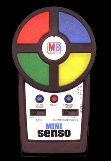

Heres a picture of the very famous, portable Mini Senso.
The Game is about pushing buttons in the right sequence, which is shown to you with increasing speed.

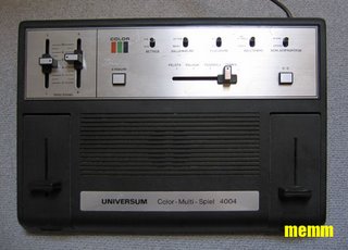


Pong, one of the first videogames was "invented" in 1972.
The aim of the game should be known by most people here: "Avoid missing ball for high score". The game is for two and every player has his paddle in his part of the screen, which he can move up and downwards. The ball of the game is always moving and the players have to block the ball so
that it cant reach their screenborder (that would be a goal for the other player). By blocking the ball it is also shot toward the goal of the contrahent.
In the first picture we have the Universum Multi-Spiel-Color A" (Spiel means game) where the paddle controller of the right player is build into the console.
The controller for the left player can be detached from the console and is wired to the rest of the machine with a very long cable.


The vectrex was always called "the king of videogames".
No other console before or after the Vectrex had a comparable configuration, and no other non-portable game console had a monitor of its own (integrated).


The genuine Atari CX 40 "Standard Joystick Controller".
The mother of all joysticks ( the cx40 was the first
joystick at all).


The Atari Driving Controller.
The "wheel" can be moved without being stopped at
the limits of both directions.
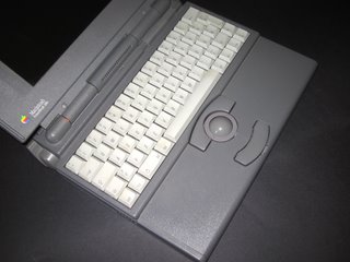


old Apple Powerbook (1994) spheric controller.


Belkin's Nostromo represents a collection of keys, a mouse wheel
and a directional pad cleverly baked into one unit.

Most of the old fashion games images come from: www.memm.de

Monday, April 24, 2006

Major task_Location


Once highlighted the profile of the user,
I started thinking about the location where
the machine could be placed.
As we can note, there are controversial results,
which show both teen-agers (12-17) and people
in their thirty as the majors users of a service
like that.
Anyway, I found the report from NPD much more
convincing than the other, so I will keep the
olders as profile of my users.

In many countries it's common to find vending
machines almost everywhere (think about japan) and find
inside them every sort of product, from most basic as food to
more complex forms of interteinment.
in those countries it doesn't really matter where the machines
are located... normally they
are placed on the streets, close to bus-metro stations
or in walking areas, but mostly in waiting spaces
and recreation areas.

However, we cannot find this kind of consumistic
culture everywhere.
For those countries, which haven't this inclination, I
individuated some places where people might
need entertainment.
Firstly, I detected waiting rooms
in Train stations and Airport lounge.
I also tought about recreation areas in corporation
buildings and offices ( maybe placing the machine
besides the coffee one...).
Also places like Starbucks interested me, because
a lot of people spend their time there reading,
listening to music and drinking coffee.

Usually in places like hospitals people look for
some kind of entertainment, because life there is
so slow and boring...
but maybe a place like that would requide a specific
design or just a different visual aspect.
I'd really like that a single product could fit without
problem in many different ambients.
I'm looking for the key of that.

Major task_Music organisation

I decided to organize the data inside my machine following one of the most powerful methods called faceted classification.
"Faceted classification is a bottom-up scheme.
Here, each object is tagged with a certain set of attributes and values, and the organization of these objects emerges from this classification, and how a user chooses to access them.
Faceted classification allows for exploration directed by the user, where a large dataset is progressively filtered through the user's various choices, until arriving at a manageable set that meet the users' basic criteria. Instead of sifting through a pre-determined hierarchy, the items are organized on-the-fly, based on their inherent qualities.
"Here you have a nice example of that: www.bestcellars.com
(a smart wine selling website).
In this way I had a lot of inspiration from Dan Hill's work for BBCmusic site.
He tryed to fuse different methods of organisationdeveloping new ways of searching for music, like the six dimensionaldiagram with the followings facets: Artist, Genre,Technique-instrument,Esoterica-theme, location and time (for more information go to www.cityofsound.com).
Also the replyes in the blog from different kinds of researcherswere very useful for me, expecially the one that suggested "Utility" as an important seventh dimension: infact it will be particularly useful when your "map" moves further back in time than the last fifty years.
All the blog had deeply inspired me, and stimulated to look fornew kinds of classifications, like the one that I'm developing:"mood". this would be the missing link between all previous facets,and show up the relation between music and books, movies,fashion, art or a cultural context.
Some other interesting ideas came from Audioscrobbler Browser,where you have a visual output of the relationships between relatedartists.

Sources:

http://www.peterme.com/archives/00000063.html
www.cityofsound.com
http://www.di.fm/edmguide/edmguide.html
http://www.last.fm/
http://www.pmbrowser.info/audioscrobbler.html

Paolo Dell'Elce

Sunday, April 23, 2006

Major task_users


My research of trasforming an internet service in a
physical one is definitly focused on the music.
I started my research from the possible users of a
kind of product like this, analyzing reports
from studies about on-line-music-store users.
I found a lot of interesting (and funny!) material that
will be very usefull for me to design the machine.
Here we have a report from Clickable Culture (on www.secretlair.com):

_iTunes Web site and use of iTunes up 241% in 2005
over2004, reaching nearly 14% of the "active
Internetpopulation" or 20.7 M unique visitors.

_ 12 - 17 year-olds are nearly twice as likely to interact
with iTunes than average internet users.

_iTunes users are 54% male and 46% female

_iTunes users favour Volkswagen cars, which they are
2.2 times more likely to own than the average Internet user.

_iTunes users favour hard cider as their drink of choice.

_Tunes users are 3.3 times more likely than average
to read Wired magazine

_iTunes users watch the Cartoon Network at 1.4 times the average rate

Some other comments about the subject from npd.com (for full text go to the site from the link below):

" iTunes is proving to be a formidable competitor against free peer-to-peer (P2P) file-sharing services...
Apple iTunes’s industry-leading a-la-carte download store tied with LimeWire as the second-most-popular digital music service in March, 2005. Both iTunes and LimeWire were used by 1.7 million households.
The most popular digital music service that month was WinMX, which was used by 2.1 million households to download music.
Paid a-la-carte music offerings from Napster and Real Networks also placed in the top ten, alongside other P2P services like iMesh and Kazaa.
In total, four percent of Internet-enabled households in the United States used a paid music download store in March,2005.
A large number of these consumers were over 30 years of age (reporting an average age of 33 years and an average household income of $83,000). Though younger demographics are more likely than others to share files on P2P services, NPD’s research shows that older consumers are more likely to be deterred by the recording industry’s anti-piracy litigation efforts. The growing legal download services provide a perfect alternative for the post-college demographic.
“They have diminishing free time, and more disposable income,” said Crupnick. NPD’s research shows that the litigation raised awareness of legal issues surrounding P2P music downloading, which provided the final tipping point for many of these older, more financially secure customer segments.
Those that had tried digital music through file sharing were slowing down or stopping that illegal behavior, and many post-college consumers
are leading the charge into legal a la carte downloading.”


The following list shows the top ten digital music services, based on the number of households acquiring a digital
song in March 2005:
1. WinMX (2.1 million)
2. iTunes (1.7 million)
3. LimeWire (1.7 million)
4. Kazaa
5. BearShare
6. Ares Galaxy
7. Napster
8. Morpheus
9. Real Player Store
10. iMesh

Source:

http://www.npd.com/dynamic/releases/press_050607.html

http://www.secretlair.com/index.php?/clickableculture/C183/P20/

Paolo Dell'Elce

Monday, March 13, 2006

Major task_research

I started my research looking at various internet services (as amazon, iTunes music store, Skype,etc.) which really fascinate me.I looked at those services with different points of view: I tryed to understand how they are structured, Who uses them, why, and what do the people buy. I focused on iTunes music store, the first music store on-line. I analyzed all the service that it offers and the reasons why people buy on it instead of in a physical record store. After my research I tought that this service is so powerful and interesting, but limited to the internet-buyer community. I'd like to bring it outside the net, in the physical world, in everyday life and spaces and make those services quick and simple to use for everybody, using the internet technology but with no more computer, mouse or keyboard...the challenge is to design a new, specific concept of public service to get music directly inside your Mp3 player wherever you are, in a natural and fast way, as you buy a can of coke...

Task 3_touchable service


The challenge of this task was to find new applications and ways to use
the RFID technology, recently implemented by nokia, that built a prototype of the 3220 model wit this technology inside.
The rfid is a radio frequency based technology, that consist in the identification of object, animals and people by reading information inside a tag (microchip with data). We have some examples of the ordinary use of this technology in japan, where it is used for almost every kind of payment/booking services (for more information visit http://www.suica.jp/).
Me, Einar and Andre have looked at how RFID can be used as a link between people and the services that the city offers.
The Main idea, was to put RFID tags under city maps that you can find all over the city: using your mobile phone you could have url links to all theservices marked on the map, and have a lot of informations as schedule time of cinemas and theatres,opening time of shops etc.
We designed a simple graphic interface for this kind of map: it is divided by areas, you have an overview of all the zone of the city where you can use this services and a zoom of the area where you are at the moment, with all the rfid links, marked by the little grey and yellow phone logo.
You would find those maps in some strategic places of the city as bus stops, metro stations, shopping malls etc.
We also went in deep prototyping this service for an indie-recordstore in Oslo called Tiger, andhis community of loyal customers, wich use the shop as a musical information center.
You will find more info on this part of the project on Einar's weblog: http://einarproject.blogspot.com/

CuteCircuit's workshop


The CuteCircuit workshop was an amazing experience: it brought a lot of fresh air to my idea of interaction design, after an infinite and boring electronic and programming workshop week with Tom Igoe.
Cute Circuit are Francesca and Ryan, two of the firsts graduated at the worlwide well-knowed Ivrea Interaction Design Insitute, in Italy.
Now they are involved in wearable computing projects, and they're taking lectures and workshops about interaction design all over the world.
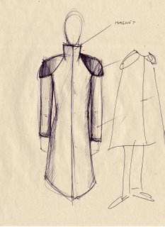
After an interesting theorical introduction to both the fashion and wearable computing worlds, all the partecipants were invited to design something, starting from many different main themes obtained from various braimstorming sessions. Me, Stig and Marie were the Trasforming team (!).We designed an everyday/protective suit to use in a future pandemic.
It would be not just a protective suit but also an interactive message
of cleanness, infact when the plastic fabric gets in contact with disinfectants,four blue light under the suit start to bright.
There is also a PIR sensor on the back of the suit wich advise you if someonecomes from behind, over the "Recommanded social distance of three meters".
Here you have some images of the projects and the funny fashion show.

Thursday, February 16, 2006

Task 2_collaborative instruments


We started this task with a class-braimstorming session to decide the main theme of the instruments;We chose "Outer Space", from a Jorn's idea.Than my group (Einar, Anna, Jorn and me) started to think about various kinds of instrument-game and how to interact with them. We finally decided to build an alien puppet that makes sound when hugged.in the next days we built a rough prototype to be sure that the concept could work; than Einar started programming with Max,explaining us how it runs.While the programming was made, we built the final presentation model in the school's workshops, cutting polyurethane foamand sewing hairy textile.the instrumentthe instrument consist in an hairy, pink, big "sausage" (that rapresents an alien character...) stuffed with polyurethane foam, with inside two speakers which work as microphones , covered by metal wool.When the wool is pressed against the speaker it sends sound signals to the computer, which then are converted to numbers in Max and used to control the instrument.It works pretty well, is a real interactive percussion instrument: infact it could be used punching, hugging, or just sitting on it.

Sunday, February 05, 2006

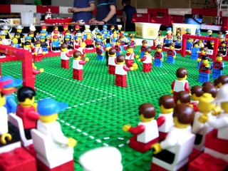
Task 1_embodied play: Legoland


"Lego bricks with sensors inside make it possible to build Lego models and use them inside a computer game.
Everything can be made, from basic shapes for children to much more sofisticated artfacts: infact you can build your own town, characters, veichles etc.
The game:
With Legoland it could be possible to make some categories in wich you have different task to achieve: for example you can choose to play a sport competition game, a war game etc, or just build a city where your characters/else lives and plays around.
The game is very interactive, because you're called to build physically your stuff.
The equipment required is just a consolle or a personal computer, a controller and Lego bricks with sensors."
Concept by Paolo Dell'Elce & Andre Borgen

Wednesday, February 01, 2006

The art of innovation_a book by Tom Kelley


About the author
Tom Kelley is general manager of IDEO, the world's leading design consultancy specializating in innovation and product development.
Working together with his brother, IDEO founder David Kelley, he has helped manage the firm as it as grown from 20 designers to a staffof over 350.
About IDEO
IDEO offers innovation strategy and design service.
They identify opportunitie for innovation by understanding latent users needs, technology factors, and business requirement for success.
They're multidisciplinary teams includes specialist in human factors research, business strategy, industrial and interaction design, environments design,mechanical, electrical, software and manufacturing engineering, design validation and more.Some of IDEO recent clients are: 3M, BBC, BMW, Cisco System, Logitech, MC Donalds,Microsoft,MoMA, Nike, Polaroid, Prada, ecc.Some of IDEO most important project has been: the original Apple mouse, Trackball, Palm V handheld organizer, Lisa computer (forerunner to Mac) Standup toothpaste tube.
The main subject

-they pressent themselves as a dinamic group, consisting of people with many different backgrounds.

-The IDEO method, divided into 5 points:
1 Understand
2 Observe
3 Visualize
4 Evaluate and refine
5 Implement

-Innovation
"Seeing and hearing with your own eyes and ears is a critical first step in improving or creating a breaktrough product".

For more information, reviews and comments about the book visit
www.theartofinnovation.com

Presentation by Paolo Dell'Elce & Andre Borgen